The Interaction Framework is essentially a description of the structure of the interface and behaviors of a product or app. These are almost Cooper’s exact words early in Chapter 5 of About Face. We’ve seen wireframes in I300 that can show us the structure of page in a website or a screen in an app. Design frameworks are related to the smaller concept of wireframes, and they may include artifacts like frameworks. But since they also describe the interaction and behavior of an app, they go beyond simple wireframes.
The interaction framework sounds like it should be a single design artifact, but Cooper instead means a collection of steps and concepts together provide the framework for how the interaction is designed. It may include several design artifacts: sketches, diagrams, lists of named elements, and detailed descriptions of user-system interactions.
Sketches
Cooper describes a six-step process of defining the interaction framework. The fourth step is to sketch it. Let’s skip to that and see the example from the text.
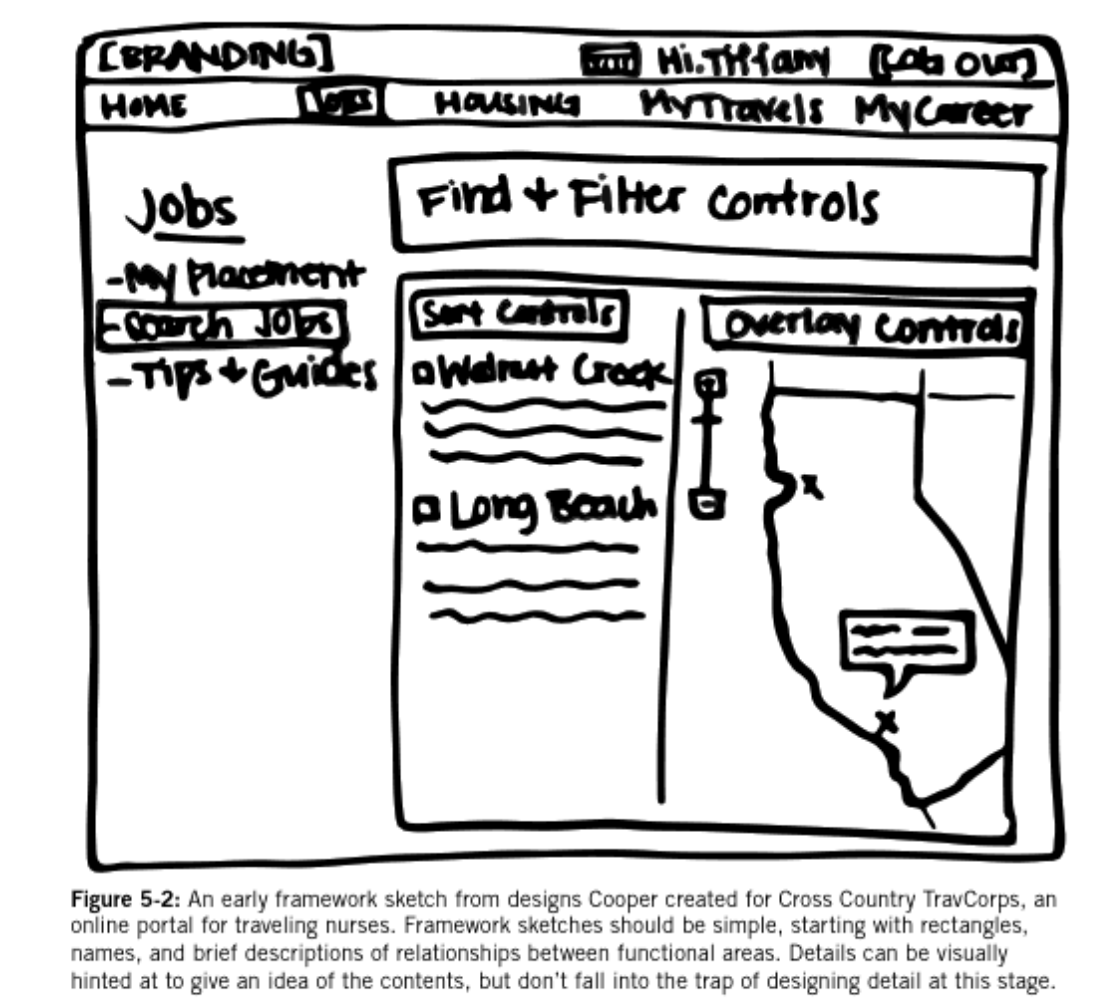
The relationship between this sketch and an I300 wireframe is pretty clear. They’re both low-fidelity, but this one has more detail, including names like Jobs, Sort Controls, Overlay Controls, etc. During the design process, it must have been established before the sketch that these controls were necessary. That necessity gets established in Coopers second and third steps, so let’s review the first four steps now:
- Establish form factor, and posture
- Establish data elements and functional elements
- Establish functional groups and hierarchies
- Sketch the framework
The first step involves establishing what kind of product is being designed. We will cover this in more detail in a later chapter, so for now it suffices to state that the form factor and posture essentially describes what kind of app (tablet, desktop, …) is being designed. In the previous chapter we saw that data requirements and functional requirements related to objects the user interacted with and app behaviors. Those requirements essentially describe what the data and functional elements are and what they can do.
Data and Functional Elements
If a user views, creates, or modifies objects or information in the app, those are likely data elements. They could be images, documents, social media posts, calendar items, or any other things the user may deal with in the course of using the app. The functional elements are parts of the app that do things (functional) rather than are things (data). They may often modify data elements, and they can often be thought of as features of an app. Functional elements often act on data elements. If we have a data element that is an image, a functional element may resize it, change its colors, and so on. Other functional elements may upload images, share them, or create new empty ones.
The requirements written down previously allow the designers to describe what tasks the user must be able to do or accomplish, and from those requirements, the different data and functional elements supporting these tasks can be written down.
Functional Groups and Hierarchies
Functional groups are simply groups of elements. If we have an image data element and have many functional elements that operate on that image (resize, change color, create new image, delete image, …) then all these functional elements plus the image data element make up a functional group. It’s also possible to have a group that consists of multiple data elements. A post on FaceBook or another social network may involve content, an avatar, a score (number of likes, etc.), and comments. Each of these is a data element, but in the interface we may also conceive of them as one entity (“a post”). These combinations are often presented to users on cards or other widgets where their proximity and visual separators between other elements on the page indicate the grouping. The groups should be named just like the data and functional elements should be named.
These groups may be related to each other or even be nested within each other (one functional group may include another), and these relationships make up the hierarchy. The importance of the hierarchy is that it reveals at a glance the ways the different named elements and groups are connected to each other. The names are particularly important since they can be used as labels or for reference in notes and annotations of the diagrams and sketches in the interaction framework.
Key Path Scenarios
The next step in Cooper’s process is to construct key path scenarios. A key path scenario is a description of how a user completes a key path in an app. A key path is just like the name describes. It’s an important path for the user in the ask; a path or task that is critical for the user to accomplish their goal. Key paths will likely correspond to requirements that were written down previously.
At this point in a design, the interface has been sketched out, the data elements a user interacts with have been identified, and the functional elements have, too. All this is to say that the designer will have worked out in some detail how the app will work or how the interaction will proceed. The key path scenarios thus describe in detail how a part of that interaction proceeds. We have in fact seen something similar in I300 where we called that detailed description of part of an interaction a use case. So we can use I300 use cases as key path scenarios, or we could use a different design artifact format that describes the interaction in the same level of detail.